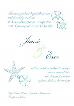
Invitations
I have to first admit that I do some graphic design for work - mostly basic stuff, nothing glitzy or glamorous. Still fairly basic, but probably can do this stuff easier than most of the population. I work in InDesign (CreativeSuite 2, because we're too cheap to upgrade - I put my foot down at work and we'll be upgrading to CS5, when it comes out. Sigh.) Anyway - I know just enough to be able to pretty easily do most of the stuff necessary to do my invites and all the other paper stuff associated with the wedding (Programs, monogram, menus, etc.) Another help is that I can borrow my office's paper cutter whenever I like - let's hear it for industrial-strength blades!
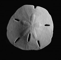
We DIY'd the invites, with some designwork assistance from my pal, the award-winning Double A. (he's single, ladies!). He did the sand dollars for me, and I thought they came out great.
* Of course, because it's my life, we ended up with a bit of a snafu (read: diet coke spill) regarding some of the invites, causing me to punt. I had to create approx. 15 invites that were a little different - I just printed the invite on white cardstock, mounted them on light green and light blue textured stock, and mailed them in white envelopes. There's a reason I load up on caffiene early - and should have done so and cleared away anything that could cause disaster. live and learn.
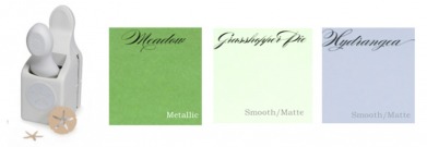
I ordered all of my invitation supplies from Cards & Pockets, using off-white cardstock, grasshopper pie invite mats, and meadow (metallic) pocketfolds & envelopes. We used ivory ribbon for bellybands, and punched out ivory sand dollars using the Martha Stewart punch - mounted the sand dollar on a navy square of cardstock to seal. (pic of the final invite forthcoming.)
Posting these here, the colors aren't exactly the same - the text seems more teal-ish, and the green is neon. Its more of a light sage/celery green. I used both navy and a lighter blue text. Oh well.
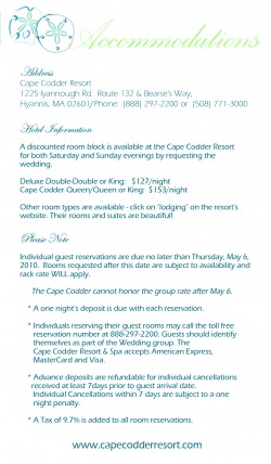
The accommodation, directions, and need-to-know cards are all in the side pocket.
The accommodation, directions, and need-to-know cards are all in the side pocket.
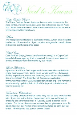
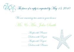
A good Knottie, I learned that its quite rude to list "Adult Reception" on your invites. I would argue that its ruder to bring young children to a wedding having an adult reception, but that's another argument for another day. Regardless, I thought the best way to convey this was to personalize the response cards, indicating how many seats were "reserved in their honor". The childcare note in the need-to-knows I thought was a nice hint, too.
The response card envelopes are either hydrangea (from C&P) or white, in my "disaster relief" set of invites.
The response card envelopes are either hydrangea (from C&P) or white, in my "disaster relief" set of invites.
